PTE Describe Image List 2020 – Top 50+ PTE Describe Image
PTE Describe Image – Every week, we’ll be posting new Describe Image practice samples, so make sure you keep checking back!
PTE Describe Image
In this article, we will provide full detail related to this question type. These questions are designed to test your speaking skills. Attempt the following PTE Describe Image practice charts by speaking to the following types:
- Process/cycle
- Flowchart
- Line graph
- Table
- Bar graph
- Pie- Chart
- Picture
- Maps
You need to understand an image, think quickly and deliver fluent, grammatical and relevant sentences.

PTE Describe Image List
Instructions:
1. You have 25 seconds before to start for recognize the image.
2. You have 40 seconds to complete the image. Way to explain image in 40 seconds
3. Press next button after completion or it will automatically stop after 40 seconds.
PTE Describe Image Tips and Tricks
1. Recognize just important points.
2. Speak up to 30 seconds minimum.
3. Do not stop yourself.
4. Everything is not possible to explain.
5. Oral Fluency, Content, and Pronunciation should be clear.
In case you find it difficult to explain PTE Describe Image, remember these Describe Image Tips and Tricks from our experts.
Our method is to use this framework:
1. Title, x-axis
2. Three key features
3. Conclusion
User Guide – Step by Step Solution
We are sharing top 50+ PTE Describe Image 2020, 2019 and 2018 questions with answers.
PTE Describe Image 2020

PTE Describe Image Samples
Answer – This image represents the procedure to download music from Tesco Extra. In the first step, users search for the music they are looking for. Secondly, users purchase the music using their credit card. After that, the music becomes available for download. Finally, users can play and enjoy the music that they love. In conclusion, this seems to be a very convenient way to access the music that you fancy.
Pte Describe Image Practice
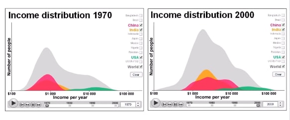
Answer – These two graphs compare the income distribution in the USA, China, India and rest of the world. During year 1970, the average annual income in China and India was around thousand dollars per year, while in the US the income was much higher. During year 2000, there was an increment of income in all countries. In conclusion, in US the income was equally distributed for both years, but for other countries it was distributed equally only in year 2000.
Pte Describe Image with Answer
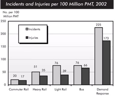
Answer – The bar chart compares the number of incidents and injuries for every one hundred million passenger miles traveled on five different types of public in 2002. Rail services experienced fewer problems. The number of incidents light rail trains equal the figure recorded for busses but there were significantly fewer injuries at only 39. Heavy rail service saw low number of such events than light rail services but commuter rail passengers were even less likely to experience problems. In conclusion, the most incidents and injuries took place on demand response vehicles.
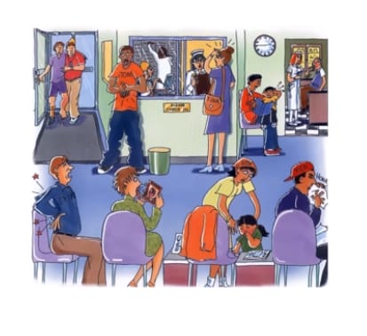 Answer – This image represents a scene at a medical centre. At a first glance it seems that the clinic is full of patients waiting to get treated by the doctor. The nurses at the check-in is busy noting down the details from a patient and other nurse is talking on the phone with booking appointments. While siting a patient is honking to clear his nose, behind him a red faced little girl is waiting with her mother in line. Another patient is checking her tongue in mirror and a guy is holding his painful back. In conclusion, it seems that this medical centre is very busy with patients with variety of illnesses.
Pte Describe Image Template
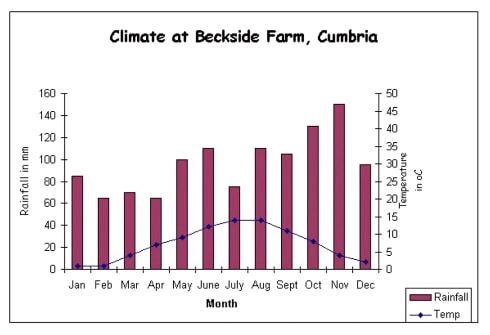
Answer – This graph represents the climate at backside farm in Cumbria. The temperature ranges from 2 to 15 degrees celsius while the rainfall ranges from 60 millimetres in February in April to about 150 millimetres in November. It seems that winter months are from November to February and summer period is from June to the end of August. It rains all year round with varying amount of precipitation however the average precipitation is 60 to 100 millimetres with the maximum of 150 at the year end. In conclusion it is a cold region with plenty of rain throughout the year.
PTE Describe Image 2020 Exam question
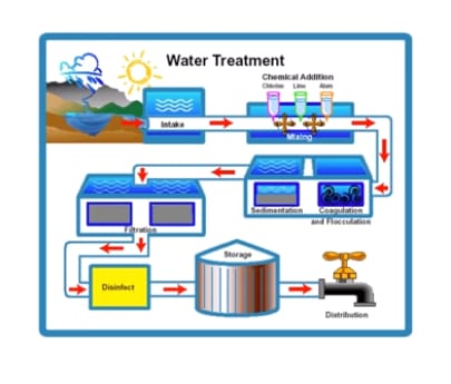
Answer – This image represents the flow chart of a water treatment plant. In the beginning the water is made available from a lake and it passed for a chemical treatment of chlorine, lime and alum. After mixing the chemicals it is first allowed to coagulate and flocculated then passed though sedimentation process. Following that the filtration and disinfected procedures are carried out. The disinfected water is stored in a storage talk before sent for distribution. In conclusion, the water treatment process looks multi-staged and systematic to provide clean water for public.
PTE Describe Image with Answers
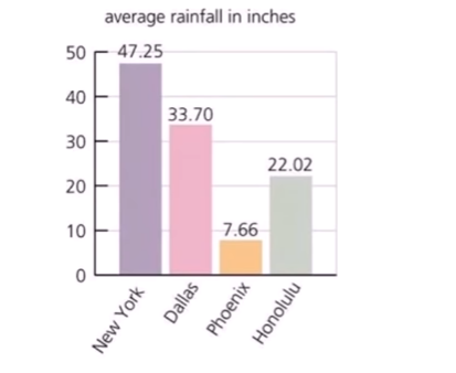
Answer – This bar chart represents the average rainfall in New York, Dallas, Phoenix and Honolulu. The highest rainfall was seen in New York with 47.25 inches. The city of Dallas faced 33.7 inches while Honolulu saw almost 22 inches of rainfall. The lowest amount of rainfall was in the city of Phoenix at 7.66 inches. In conclusion, the New York city was the wettest while Phoenix city was the driest among the four.
PTE Describe Image 2020
Answer – This image represents the process of production of a sleep hormone called Melatonin. When human eye see candle light there is inhibition, and during darkness there is stimulation of melatonin production. The melatonin is produced in the brain by pineal gland, upon the stimulus form they eyes. The production and inhibition creates the biological clock of the body. In conclusion, this shows how our body responds to the light and darkness, and how the production of Melatonin depends on the light.
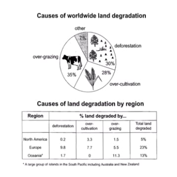
Answer – The pie chart introduces the main cause of worldwide land degradation in percentage scale, whereas the table shows reasons of land degradation by three regions: North America, Europe and Oceania. Overgrazing is the min reason of worldwide degradation and it reached 35%. 30% and 28% of degradation was due to deforestation and over-cultivation respectively, leaving 7% for other reasons. Most deforestation and over-cultivation occurred in Europe, while overgrazing was the main cause in Oceanic. In conclusion, overgrazing is the main cause of worldwide degradation and most degraded land is Europe.
PTE Describe Image Practice
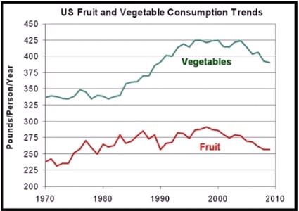
Answer – This line graph represents the trends of vegetable and fruit consumption in the United States. The data between the years 1970 and 2010 shows that vegetables were more popular than fruits for the entire period. However, consumption of vegetables increased sharply from the year 1980, on the other hand, trend in fruit consumption was mostly steady. In conclusion, there was a decline in the consumption of both veggies and fruits in the year 2010, probably because of increase in the popularity of meat consumption.
Describe Image for Pte
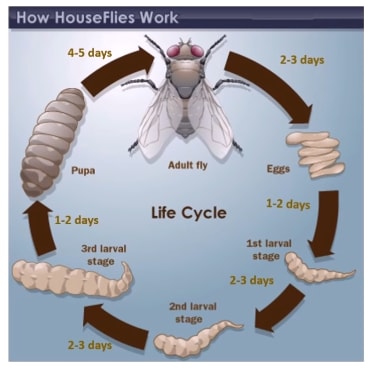
Answer – This image represents the life cycle of a housefly. In the beginning, an adult housefly lay eggs. The eggs get hatched and larva comes out. The larva passes through three stages of growth. The each larval stage lasts from 1 to 3 days. The larva turns into pupa in 1 to 2 days. Lastly, the pupa develops legs and wings between 4 to 5 days to become an adult fly. The female adult fly becomes ready to lay eggs again in 2 to 3 days. In conclusion, to complete the life cycle of a housefly, it takes between 10 to 15 days.
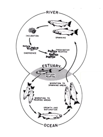
Answer – This picture represents the stages in the lifecycle of a salmon fish. Salmon begin its life in a river where the adult fish lay and incubate their eggs. After emerging from eggs, the young salmon spend the next stage of their life in freshwater. Then, at some point in their development, the fish swim downstream to river estuaries where rearing continues. The maturing salmon migrates to the ocean, where they eventually become fully grown adults. Finally, the adult fish travel back upstream to spawning areas of rivers; here they reproduce and lay their eggs, and the life cycle begins anew.
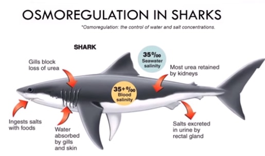
Answer – This image represents the process of osmoregulation in sharks. To maintain the water and salt concentrations inside the body, the shark ingests salts with food. The water is absorbed by gills and skin, the gills also function to block the loss of urea. The most of the urea is retained by kidneys and leftover salts are excreted as urine by rectal gland. In conclusion, the osmoregulation maintains 35% salinity in the blood which is equal to the seawater sun ounding the shark.
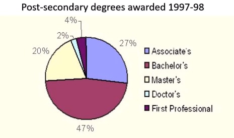
Answer – The pie chart represents the proportion of post secondary degrees awarded during year 1997 and 98. The highest degree were awarded for first professionals at 47%. It is followed by associate’s degree at 27%, 20% degrees were awarded for students who completed master’s while smallest proportion was for bachelor’s and doctoral degree programs. In conclusion highest number of degrees were awarded for first professionals while the lowest numbers of degrees were awarded for candidates who completed their doctoral degree program.
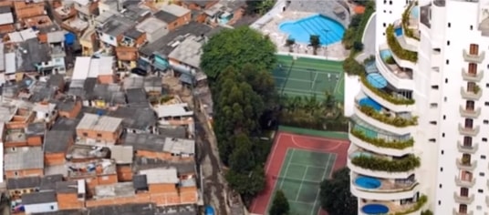
Answer –This image represents the issue of space and economic inequality in the developing nations. On the left side of image there is a slum area with small houses built in an unregulated manner. The small houses are built in congestion and it clearly lacks transportation roads and space for recreational activities. On the other hand, on the right hand side there is a multistorey building with each flat having access to a balcony and sunlight. In addition, there is a common play ground and swimming pool. In conclusion, the multistorey buildings have solved the problem of space in overpopulated countries.

Answer – This pie chart compares various web browsers according to their usage in percentage. Firefox is liked by almost 40% of the users, while the internet explorer and Chrome are second and third respectively. Very least proportion of people use Opera and Safari. In conclusion, Firefox was the most popular while Opera browser was the least favorite among the Europeans.
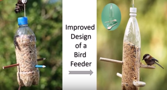
Answer – These two images compare the old and improved design of a bird feeder. The bird feeder mainly consists of a suspended plastic bottle on a tree branch with a rope attachment on the top. In the first structure there are wooden pencils inserted in the bottle to make a platform for the birds to sit during feeding. The newly improved design replaces those wooden pencils with flat head wooden sticks, which holds the grains for the birds to feed efficiently. In conclusion, the Improved design would prevent the wastage of grains and it looks bird friendly,
PTE Describe Image Samples
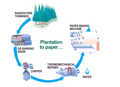
Answer – This flow chart represents the process of making paper from radiata pine thinnings. Firstly, a debarking drum is used to get the bark off the wooden logs. Secondly, a chipper is used to cut down the wooden logs into small chips. Thirdly, water is used in a thermomechanical refiner to refine the usable material. Finally, the papermaking machine is used to make paper. In conclusion, this process seems to be very lucrative to make high-quality paper.
PTE Describe Image Practice
PTE Describe Image Sample
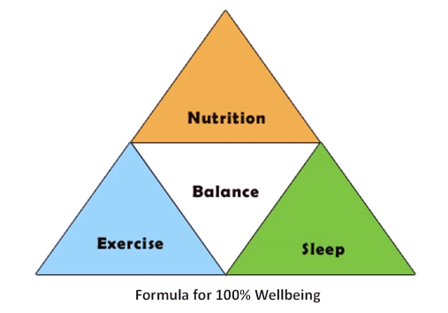
Answer – This image represents the formula for a 100% wellbeing of any person. The pillars of this pyramid are exercise and sleep, while nutrition is at the pinnacle. It is suggested that a proper balance between nutrition, exercise and sleep are essential for a 100% wellbeing. In conclusion, it seems that nutrition, sleep and exercise are interdependent and this is the formula for living a healthy life.
PTE Describe Image Questions with Answers
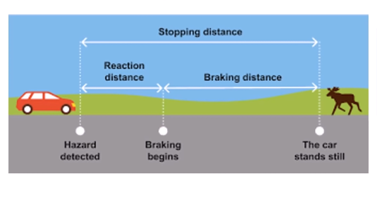
Answer – This image represents the stopping distance of a car as soon as a driver spots a hazard. The stopping distance is divided into reaction distance and braking distance. The distance between hazard detection and braking is known as reaction distance, while between braking and car standing still is called braking distance. In conclusion, a reaction distance can be reduced by an alert driver, and braking distance is reduced by a good breaking mechanism.
PTE Speaking Describe Image
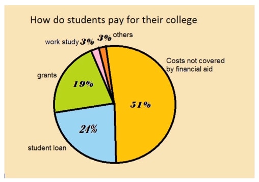
Answer – This pie chart represents how students pay for their college. More than 50% of students get the costs covered by financial aid, while almost a quarter of them get a student loan. About 19% of the students manage to get grants. A small number of them, at 3%, do a part-time work to pay for their tuition fees. In conclusion, majority of the students rely on financial aid, while very few number of students rely on their part-time work, to pay for their educational costs.
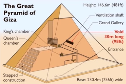
Answer – This image represents the structure of the Great Pyramid of Giza. This triangular structure has height of 146 meters and the base is 230 meters wide. The entrance is at the bottom and leads first to a grand gallery and then to queens chamber. The king’s chamber is at the top of the queen’s chamber and has a stepped construction at the back. There is a ventilation shaft on the top and it passes through 30 meter long void structure. In conclusion, this famous pyramid looks simple but has a complex structure.
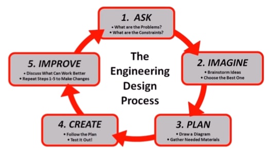
Answer – This image represents the engineering design process. The flow chart is divided into 5 steps. In the first step problem and constraints are defined, then brainstorming for ideas is done and the best idea is chosen. In the third stage, diagram is drawn and necessary materials are gathered. In the fourth step, plan is followed and test is carried out. In the last step, final improvements are done after discussion and changes in the earlier stages. In conclusion, this seems to be an effective strategy for engineering design.
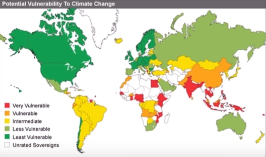
Answer – This image represents the countries on the world map that are potentially vulnerable to climate change. The least vulnerable countries are in the north America and in the Eastern Europe, while less vulnerable countries include Russia, Australia, Mexico and South Africa. The countries in the intermediate range contain south American countries, and few countries in the African continent. The vulnerable countries include China and Pakistan while the most vulnerable countries are India, south Asian countries and few African countries. In conclusion, developing countries are the most affected, while developing countries are least affected.
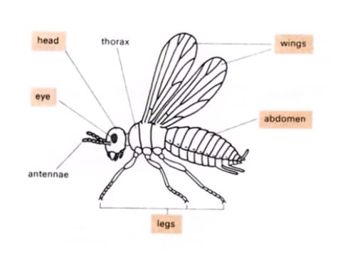 Answer – The picture represents different body parts of an insect. The body consists of three main parts: the head, the thorax, and the abdomen. The head contains the insect’s brain, eyes, and mouth. It also carries the antennae. The thorax is the central part of the body and it bears the legs and wings. There are three pairs of legs and two pairs of wings. The insect’s abdomen contains its digestive and reproductive organs. In conclusion, this marvellous creature has a very short life span.
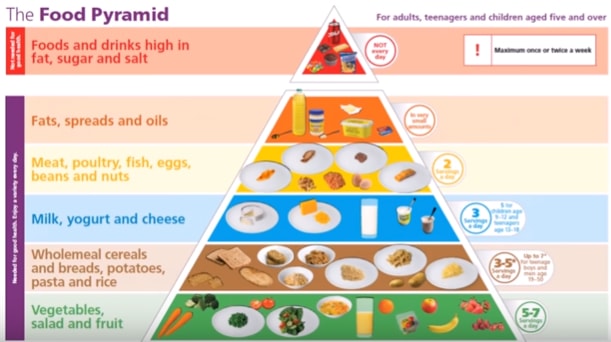
Answer – This image represents the food pyramid designed for humans over age five. The vegetables, salad and fruits is the most recommended food group which should be consumed in a 5 to 7 servings in a day. Wholemeal cereals, bread, rice and potatoes are second, while milk, yogurt and cheese are third in the order of recommendation. Meat and poultry are fourth, and fats and oils fifth, while the food which is not recommended everyday is sugar, salt and drinks high in fat. In conclusion, this pyramid shows the best and the worst foods to consume for a good health.
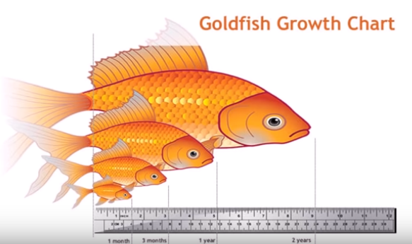
Answer – This image represents the growth chart for goldfish. There are total 4 stages shown in this picture, and their body size and age are compared. The one month old gold fish is about one and a half inches long, while at three months it becomes 3 inches long. At one year, it becomes 5 inches long, while two year old fish is almost 9 inches long. In conclusion, this is a good representation to tell the future size of gold fish by its age.
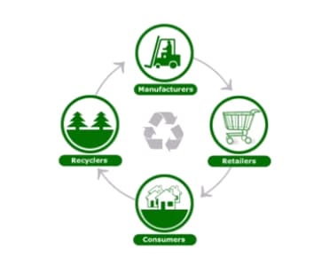 Answer – This flow chart represents the four steps involved in recycling of unwanted or used materials. In the first step, manufacturers distribute the goods to retailers from whom consumers purchase them. After complete utilisation of the product, the waster is hand over to the recyclers. Recyclers reproduce raw material to manufacturers after recycling. In conclusion, the art of converting waster into usable material does contribute positively to the eco-friendly environment.
PTE Describe Image with Answers
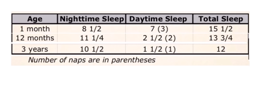
Answer – This table represents the information about sleep pattern for kids of ages 1 month, 12 months and 3 years. A one-month-old baby sleeps almost an equal number of hours during the day and night. A 12 months and 3-year-old baby get their majority of sleep during the night. In conclusion, the amount of total sleep required for a baby reduces as they get older, and the frequency of naps also reduce.
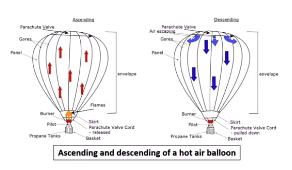
Answer – These two images represent the process that leads to ascending and descending of a hot air balloon. During ascending, propane tank burner flame creates an airflow. The airflow creates an upward lift for the balloon. On the other hand, during the descending process burner is switched off. The air is allowed to escape from the top of the envelope through the parachute valve. In conclusion, the hot air balloon works on the principle of hot air to got up, creating a lift.
PTE Academic Describe Image with Answers
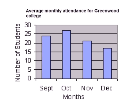
Answer – This bar graph represents the average monthly attendance record for Greenwood college from September to December. The number of students attended the college during the month of September was about 24, the number grew to over 25 students in the month of October. During the last two months, the attendance fell dramatically to just about, 18 students in the month of December. In conclusion, the attendance dropped during the end of the year probably because of Christmas and new year holidays.
Pte Describe Image Vocabulary
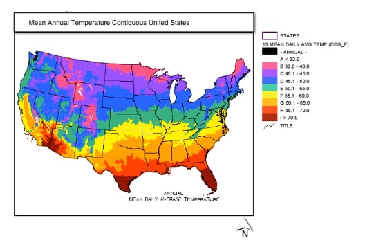
Answer – This image represents the mean annual temperatures across the United States. The southern states are the hottest with mean daily temperature ranging from 70 degree Fahrenheit and above while northern states are the coldest with temperature ranging from 32 to 40 degree Fahrenheit. The states located in the middle of the country show the temperature range from 50 to 60 degrees Fahrenheit. In conclusion, the daily temperature are very high in the far southern region while very low in the far northern region.
Pte Describe Image with Answers pdf
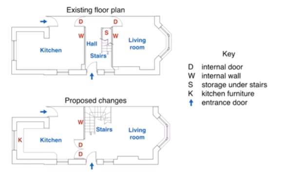
Answer – This image represents an existing floorpan and proposed changes to an apartment. A typical unit consists of a kitchen a hall and a living room. In the proposed changes the internal wall separating living room from Hall is removed and the position of internal doors is also changed to the opposite side. New plan also consists of kitchen furniture. In conclusion, under the new plan this apartment looks much more spacious however, the concealed storage under the storage will not available for the residents.
Pte Describe Image Tips
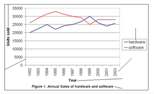
Answer – This line graph represents the annual number of hardware and software sold from year 1992 to 2002. In 1992 to 20,000 units of hardware and over 25,000 units of software were sold. There was dramatic increase in the sale of software for next three year before falling back to original sales number. In year 1999 there was a gradual increase in hardware sales until 1999 before falling back to 25,000 unites. In conclusion software sales were higher during the ten year period while hardware sales were less promising except in year 1999.
Or
Answer –This line graph represents the annual sales of hardware and software from year 1992 to 2002. In year 1992, 20 thousand units of hardware, and over 25 thousand units of software were sold. There was a dramatic increase in the sale of software for next three year before falling back to original sales number in year 1999. There was a gradual increase in hardware sales until year 1999, then it falls back to 25 thousand units. In conclusion, the software sales were higher, while hardware sales were less promising during the given period.
PTE Describe Image Samples
Describe Image PTE
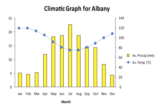
Answer – This bar graph represents the climate of Albany for period of a year. In the beginning of the year, the temperature stays at above 20 degrees and then drops until July to below 15 degrees, then grows until the end of the year. The precipitation is highest in the middle of the year, at 23 millimetre in July, while lowest in the beginning and end of the year. In conclusion, the temperature and precipitation are inversely related to the city of Albany.
Repeated Describe Image PTE 2020
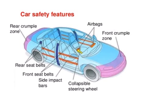
Answer – This image represents the various car safety features. The front and back crumple zone protect the car from the front and rear impact. There are multiple airbags placed in the car cabin to protect the passengers in case of an accident. The front and back seats have seat belts so the passengers won’t get tossed after an accident. There are side impact bars to protect the travellers from getting injured from the side. In conclusion, all the safety features keep the passengers protected from any injury.
Pte Describe Image Template pdf
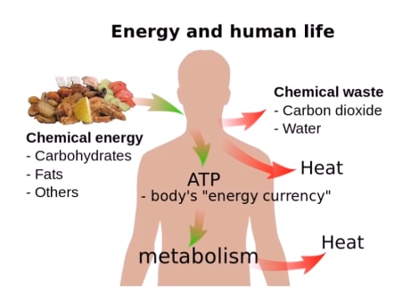
Answer – This image represents the relationship between energy and human life. The chemical energy for human metabolism is provided by means of carbohydrates, fats and others sources. The chemical energy is converted to ATP, which is the body’s energy currency. After metabolism body leaves chemical waste in the form of carbon dioxide, water and heat. In conclusion, food provides us energy for our daily activities and survival.

Pte Describe Image Samples
Answer – This image represents the taxi services work flow. To call a taxi, the customers can either use a telephone or the internet. A telephone operator makes a taxi booking when called by using a phone. On the other hand, a workstation desktop operator responds to online bookings. The operators feed booking information to a taxi service server, which then informs a taxi driver about the customer’s location. In conclusion, modern technology has made the taxi service work flow very efficient.
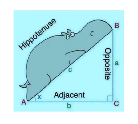 Answer – The image represents a right angle triangle. The basic is called adjacent represented as letter ‘b’, the elevation is an opposite side represented by letter ‘a’ and the hypotenuse is the line joining side ‘a’ and ‘b’. There is also a picture of a ‘funny’ looking hippopotamus leaning on the hypotenuse probably for the purpose of memorising the position of hypotenuse. In conclusion, this right angle triangle has made an angle of 90 degrees at ‘C’. This picture demonstrates the ABC right angle triangle.
Pte Describe Image Format
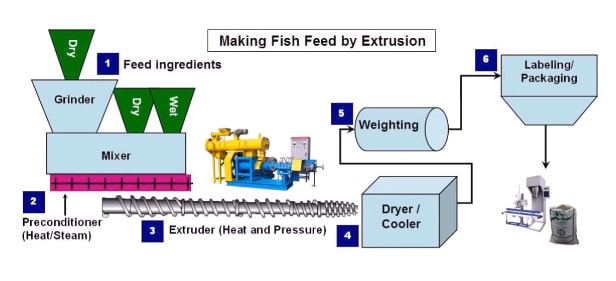
Answer – This image represents a process for making fish feed using extrusion. Firstly, dry and wet feed ingredients are fed to the mixer, the dry ingredients need to be ground in a grinder. Secondly, a pre-conditioner uses heat or steam to mix the ingredients. Thirdly, the extruder uses heat and pressure to make fish feed. The fish feed is then dried, cooled and weighing is done. Lastly, it is packed and labelled into plastic bags for shipping. In conclusion, the six stage process seems to be very lucrative.
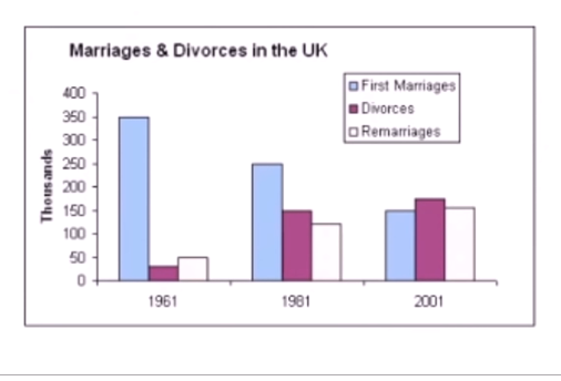
Answer – This bar chart represents the number of marriages, divorces and remarriages that occurred in the UK during the year 1961, 1981 and 2001. In the beginning, number of first marriages were the highest and the divorce rate was lowest. However, in the following years, it was opposite. In conclusion, the first marriages reduced in number while divorce rates and remarriages increased dramatically in the 40 years period.
Or
Answer – This bar chart represents the number of marriages, divorces and remarriages that occurred in the UK during the year 1961, 1981 and 2001. In year 1961 there were 350,000 first marriages. Minor percentage got divorced and about 50,000 got remarried. In year 1981 the first marriage is reduced to 250,000 and more than half of the couples got divorced and almost equal number got remarried. However in year 2001 higher number of couple got divorce.
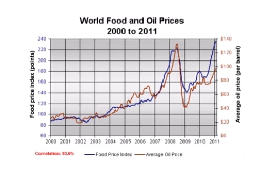 Answer – The line graph compares worldwide prices of food and oil from 2000 to 2011. In 2000, the average price of a barrel of oil was around $95, whereas the figure for food price index stood at about $90. Over the next 8 years, there was a significant increase in the price of oil, it reached its highest level at approximately $230 per barrel, compared to about $220 for food in the year 2008. By the year 2011, the food price peaked at around $140, By contrast, the figure for a barrel of oil fell to just under $100.
PTE Describe Images
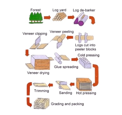
Answer – This image represents the process of producing plywood from trees. In the first stage, tree-logs are obtained from the forest and they are debarked. In the second step, the logs are cut into peeler blocks before proceeding towards veneer peeling and clipping. In the third step, the wood undergoes a process of veneer drying, glue spreading and cold pressing. In the last stage, hot pressing, sending and trimming processes are performed before the sheets are graded and packed for delivery.
Or
Answer -This image represents the process of producing plywood from trees. In the first stage tree logs are obtained from the forest and they are debarked. In the second step the logs are cut into peeler blocks before proceeding towards veneer peeling and clipping. In the third step the wood undergoes a process of veneer drying, glue spreading and cold pressing. In the last stage hot pressing sanding and trimming processes are performed before the sheets of plywood are graded and packed for delivery. In conclusion, this process seems to be fully automated and without doubt it provide high quality plywood.
PTE Describe Image Repeated Questions
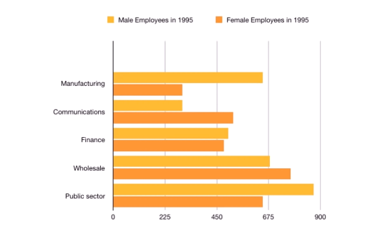
Answer – This bar chart represents the composition of male and female employees in five business sectors during the year 1995. The manufacturing and public sectors had more male employees while communications and wholesale sectors saw more female employees. The finance sector had almost the equal number of male and female workers. In conclusion, manufacturing was male dominated while communications was a female-dominated field.
Pte Academic Describe Image with Answers
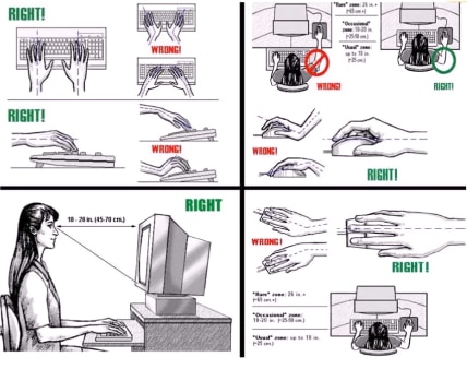
Answer – This image represents the correct technique to use a computer. The hands should be in a straight line on the keyboard and the palm should be rested properly. The operator should keep the arm close to the body in a relaxed manner and hold the mouse in a straight line. The operator should sit in an upright position and the monitor should be 45 to 70 centimetres away. In conclusion, these ergonomic techniques would definitely improve the work efficiency for the people who work daily on a computer.
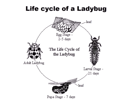
Answer – This image represents the life cycle of a Ladybug. In the egg stage, an adult Ladybug lay eggs on a plant leaf and this stage lasts for two to five days. In 21 days the larval stage starts, in which larva comes out of an egg. The pupa stage starts in 7 days, in which the young ladybird starts feeding on a leaf. After few days the young ladybug becomes an adult and the cycle repeats again. In conclusion, the lifecycle of a Ladybug completes in a months period.
describe an image
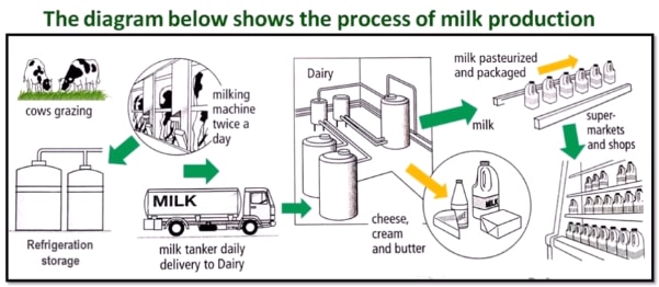
Answer – This diagram represents the process of milk production. In a farm, grazing cows are milked using a milking machine. The milk is then stored in large vessels using refrigeration techniques. The milk tanker does a daily delivery to a dairy, where milk is converted into cheese, cream and butter. The milk is pasteurized and packaged into bottles for sell into shops and supermarkets. In conclusion, the modern technique of milk production seems very lucrative and efficient.

Answer – This pie chart represents the favourite type of movies of a certain community. The most favourite movie genre was romance at 30% followed by action at 25%. The comedy and Sci-fi movies were liked by 20% each. On the other hand, only 5% people selected drama movies. In conclusion, romantic movies were the most favourite while dramas were the least favourite for the selected population.
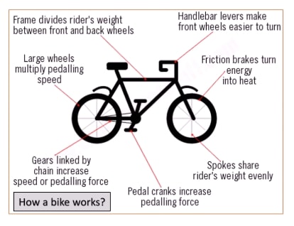
Answer – This image represents the structure and function of various parts of a bike. It basically has two wheels made up of spokes to share riders weight evenly. The front wheel is attached to the handlebar, which makes the wheels easier to turn. The back wheel has gears linked by a chain that increases speed. The chain is connected to a pedal that cranks and increase pedalling force. There is a horizontal bar at the top of the frame that divides riders weight evenly between wheels. In conclusion, this structure looks simple but it’s a very efficient means of transport.
Describe Image
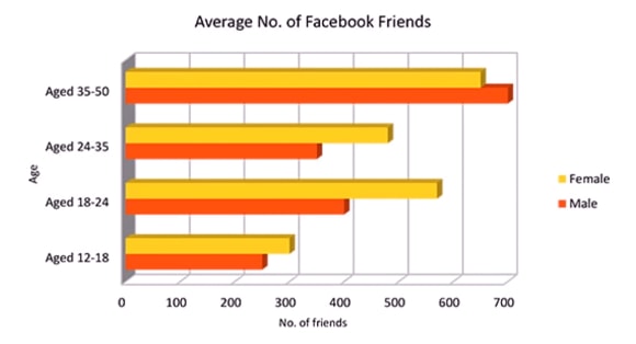
Answer – This bar chart represents the age wise number of Facebook friends for males and females. For this survey, kids under 18 had less than 300 friends. For age group 18 to 24 and 24 to 35 the number of friends were identical. The age group of 35 to 50 had the most friends with a range between 600 to 700. In conclusion, for all age groups, females had higher number of friends than males except in the last age group of 35 to 50 where males possessed more friends than females.
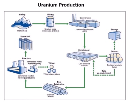
Answer – This image represents the steps involved in uranium production. The uranium ore is obtained by mining from mountains. Uranium is converted to uranium oxide by milling and then converted to uranium hexafluoride. The uranium is enriched and then stored. The depleted uranium is re-enriched again. Low-enriched uranium is used for fuel fabrication and then into commercial reactors to produce energy and Tritium. In conclusion, this process seems very effective in production of uranium.
PTE Describe Image Real Exam Questions
Recent PTE Describe Image
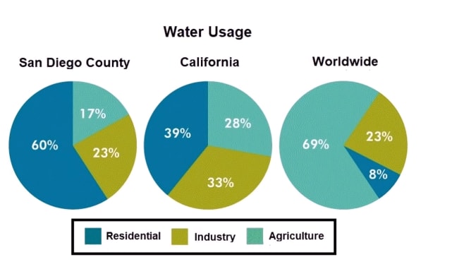
Answer – The three pie charts compare residential, industrial and agricultural water usage in cities namely, San Diego, California and the rest of the world. In San Diego and California city, the major usage of water was done for residential purpose, while worldwide usage was mainly for agriculture purposes. The agricultural usage of water was very low in two American cities compared to residential usage. In conclusion, the worldwide domestic usage of water was insignificant compared to the two American cities.
Latest PTE Describe Image
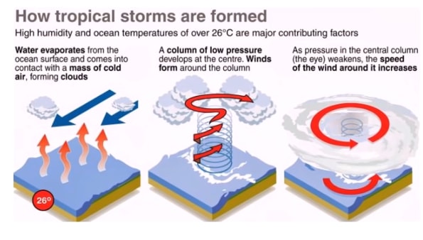
Answer – This image represents how tropical storms are formed. The major contributing factors are high humidity and ocean temperatures of over 26 degrees. In the first stage, water evaporates from the ocean surface and clouds are formed when it comes into contact with cold air. Secondly, a column of low pressure develops and winds form around that column. And when pressure in the central column weakens, the speed of the wind around it increases. In conclusion, it is clear that there are a series of event involved for a tropical storm to develop.
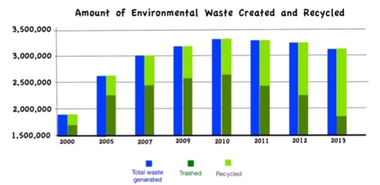
Answer – This bar graph represents the amount of environmental waste generated and recycled in millions of kilograms from year 2000 to 2013. During year 2000, least amount of waste was created and half of that was recycled. However, until year 2010 the waste recycle proportion decreased. From year 2011 to 2013, more and more waste was recycled. In conclusion, the importance of recycling the waste was observed from year 2010 onwards.
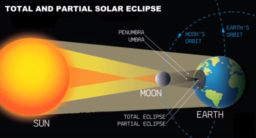
Answer – This image represents the alignment of planets that leads to a total and partial solar eclipse. When moon comes in between the sun and the earth, and when there is a straight line alignment, an eclipse occurs. When sun rays pass over the moon, they form a circular shadow on the earth surface. The total eclipse can be seen from the centre of the shadow, called umbra, and partial eclipse can be seen from the peripheral circle called penumbra. In conclusion, the occurrence of solar eclipse is rare and can be seen once in a few years.
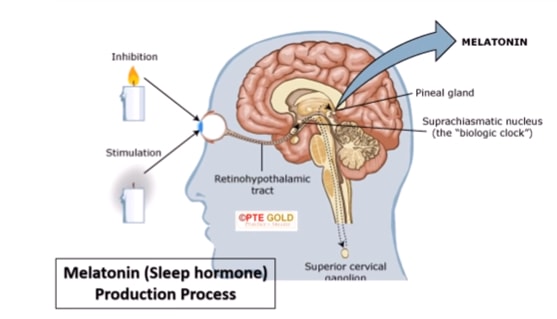
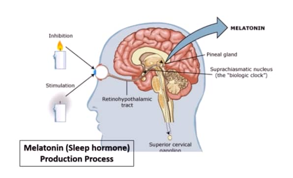
Answer – This image represents the process of production of a sleep hormone called Melatonin. When human eyes see candle light there is inhibition, and during darkness there is stimulation of melatonin production. The melatonin is produced in the brain by pineal gland, upon the stimulus form the eyes. The production and inhibition creates the biological clock of the body. In conclusion, this shows how our body responds to the light and darkness, and how the production of Melatonin depends on the light.
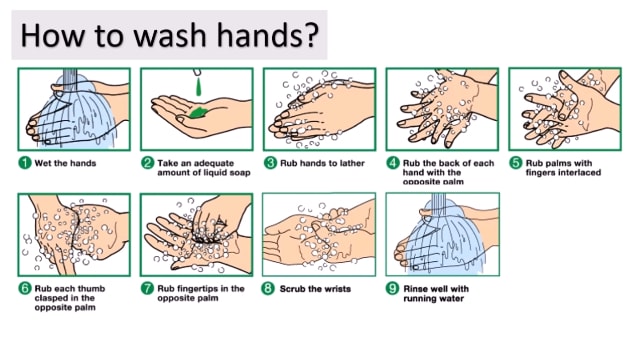
Answer – This image represents the appropriate way to wash hands. To start with, wet the hands first and then take an adequate amount of liquid soap. The hands are rubbed against each other with the opposite palm and with fingers interlaced. Then, the thumb is clasped with the opposite palm and fingertips are also rubbed with opposite palm. Finally, wrists are scrubbed and at the end, the hands are rinsed with running water to get rid of soap and the foam. In conclusion, to avoid the spread of diseases this procedure of washing hands should be followed every time.
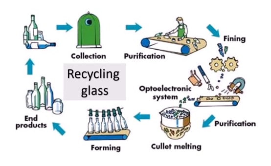
Answer – This flowchart represents the process of recycling glass. In the beginning, empty bottles are collected and they are purified on a conveyor belt by workers. Then, they are broken into fine pieces using metallic gears. An optoelectronic system is used to get rid of any impurities such as metals. After purifying, the fine particles are collected in a pot which melts the glass by the process of cullet melting. After that, they are put in the mould to give them a shape of a bottle again. In conclusion, this process stops unnecessary pollution of the environment.
PTE Describe Image with Answers PDF
New PTE Describe Image
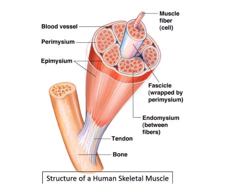
Answer – This image represents the structure of a human skeletal muscle. The muscle is attached to the bone by means of a white coloured tendon. The actual muscle is red in colour and made up of multiple muscle fibers. The outer layer of a muscle fiber is called epimysium and the layer between fibers is called endomysium. The perimysium wraps a bunch of fiber called fascicle. There are blood vessels between muscle fibers for a blood supply. In conclusion, the complex network of muscle fibers helps humans to carry out various tasks and daily activities.
Describe Image
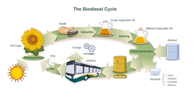
Answer – This flow chart represents the biodiesel cycle. In the beginning, the oil crops are harvested that use sunlight for photosynthesis to grow and produce seeds. The seeds are extracted and crude vegetable oil is produced from them. After refining the vegetable oil, alcohol is added to it and the process is called transesterification. The introduction of alcohol produces biodiesel and glycerol. The glycerol is used in the food and cosmetic industry, while biodiesel is used in vehicles. The co2 released by vehicles is captured by Oil crops. In conclusion, this looks very environment-friendly process to produce renewable fuel.
PTE Describe Image Answers
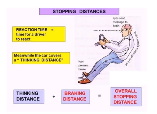
Answer – This image represents how the overall stopping distance of a vehicle is calculated. Whenever an obstacle is sighted on the road by a driver, his eyes send a message to the brain, and the brain further sends message to his foot to apply brake of the vehicle. This is called reaction time, which is basically the time taken by a driver to react. In the meanwhile, the distance covered by car is called a thinking distance. In conclusion, the overall stopping distance is calculated by adding thinking distance and braking distance.
PTE Describe Image Process
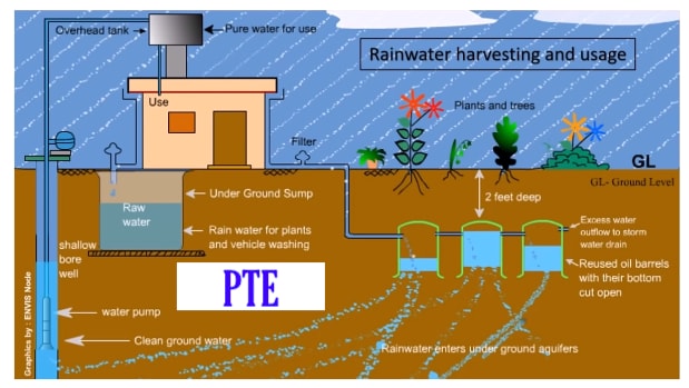
Answer – This image represents the process of harvesting rainwater for domestic and agriculture usage. In the beginning, the rainwater is collected on the roof of a house, which is transferred to the two feet deep, reused oil barrels situated in the underground. The rainwater is then allowed to enter the underground aquifers, which is then collected at groundwater reservoir. The water pump then transfers the shallow borewell water to the overhead tank. The pure water in the tank is used for domestic purposes and the raw water collected at underwater sump is used for plants and trees. In conclusion, this seems a very efficient process to recycle water.
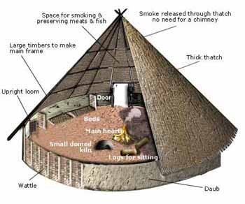
Answer – This image represents the structure of a roundhouse. It consists of thick thatch over large timbers that make the main frame of this construction, which is placed as a triangular structure on the top. The material of the thatch is porous for the smoke to pass out so there is no need to have chimneys. There is a small door for entry at the bottom, which leads to the heart of the structure. There is a space for smoking and preserving meats and fish inside as well as there are logs for sitting, and a bed. In conclusion, this is an impressive structure and very ergonomically designed.
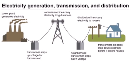
Answer – This image represents electricity generation, transmission and distribution map. The electricity is generated at a power plant located outside the city. There are a few step up and step down transformers connected with transmission and distribution lines. There is a small transformer on the pole near the home which step down the voltage further before it reaches the consumer’s house. In conclusion, the step up and step down transformers reduce the loss of electricity during transmission.
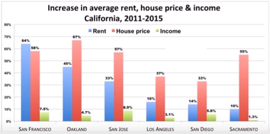
Answer – This bar chart compares the increase in average rent, house price and income in the state of California between 2011 to 2015. The highest increase in rent was seen in San Francisco, while house price increase was seen in Oakland, San Jose, Sacramento, Los Angeles and San Diego. The highest increase in income was seen in San Jose, when compared to other locations. In conclusion, the increase in average income was very little compared to the average rent and house prices in the state of California.

Answer – This flowchart represents how a virus works after infection. The first stage is adsorption, which includes attachment of the virus to the host cell. Then the virus releases its genetic material inside the cell and the virus detaches itself from the host. After that there is a replication of viral DNA and its body parts. In the fourth step the viral DNA and its body parts are assembled to form an army of new viruses inside the host cell. In the last stage, the viruses break through the cell wall to infect other cells. In conclusion, this is a good representation of how a disease is spread in living organisms.
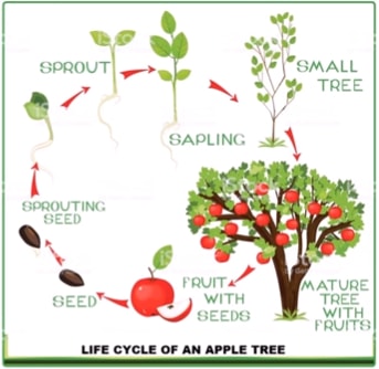
Answer – This image represents the life cycle of an apple tree. The mature tree produces fruits, which contains seeds inside it. The seeds sprout in the presence of soil and water. The sprouting seed grows leaves and roots at the top and bottom. After few days of growth the sapling become a small tree. When the apple tree matures and becomes large enough to bear fruits thus it’s life cycle starts again. In conclusion, this life cycle is common for almost all trees.
Describe Image for PTE
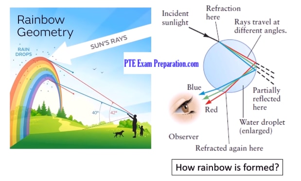
Answer – The two images represent the rainbow geometry and the formation process of a rainbow. Basically, when the sun rays enter the rainwater droplets a rainbow is formed. After entering a water drop, they are refracted and the rays travel at different angles to produce various colours, which can be seen by a naked human eye. The rainbow is visible between 40 to 42-degree angles by an observer. In conclusion, the rainbow is made up of seven colours, and the presence of sun during raining is essential for this series of events to occur.
PTE Describe Image Practice Test Series
Look at the given list of 20 PTE Describe Image Sample Tests below. Open the link, study the diagram in 25 seconds and describe the details what the image is showing. Answer these PTE describe image practice questions. You have 40 seconds to give your response. Don’t forget to write your own answer in the comment box.
1. Describe Image Bar Graph Practice Test
2. Describe Image PTE Line Graph Practice Test
3. Academic Pie-Chart Practice Test
4. Describe Image Line Graph Practice Sample
5. PTE Speaking Describe Image Table
6. Describe Image Map – Practice Test
7. Describing an Image Process – PTE Test Material
8. Describe Image Process Practice Test
9. Pearson Test of English Describe Image Maps
10. Describe Image With Answers Topics
11. Bar Graph PTE Sample Question Answers
12. PTE Academic Speaking Describe Image
13. IELTS and PTE Solved Questions and Answers
14. PTE Bar Chart Diagram Mock Test
15. Describe The Picture And Answer The Questions
17. Hydroelectric Dam Structure PTE
18. Solved Questions And Answers Describe Image PTE
19. PTE Flow Chart
20. Describe Image Life Cycle Of A Frog
How To Solve Difficult Describe Images
Every week, we’ll be posting new PTE Describe Image practice samples, so make sure you keep checking back!
To stay updated, like us on Facebook.
6:18 pm
Thanks for sharing this information.have shared this link with others keep posting such information..
12:38 pm
Thank you Emmie Marer for sharing further… Keep helping others to get a good score in PTE