PTE Academic Speaking Practice Test: Describe Image – Bar Graph
Describe Image (Bar Graph) – Look at the graph and speak into the microphone to explain, what the graph is showing. You have only 40 seconds to describe the image. These type of questions assesses speaking skills.
PTE Academic Speaking Practice Test: Describe Image – Bar Graph
PTE PRACTICE – DESCRIBE IMAGE (BAR GRAPH)
- Describe the given below bar graph #1
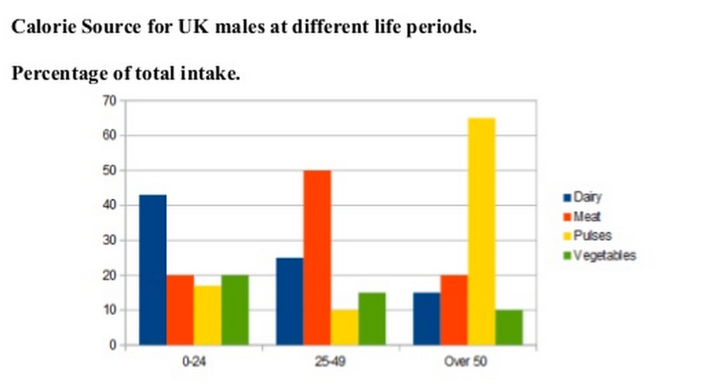
The bar chart shows the caloric intake of UK males in three different life periods or age groups of 0-24, 25-49, and over 50 years old. Dairy product for the first age group from 0-24 has the highest source of calories, while the other categories each represented about 20% each.
In second age group from 25-49 years dairy fell to around a quarter and meat became the main source of calories, which reaches about half of the total intake. There was also decrease in Pulses and Vegetables which reached 10% and 15% respectively.
In the final stage, Pulses increased six-fold to over 60%, whereas calories obtained from meat declined to 30%. Calories obtained from vegetables was 10% and even slightly less than dairy (15%). The 50+ group shows the most marked preference out of all the groups. It also confirms the gradual decline in vegetable consumption as males become older.
PTE Practice Material – Summarise Written Text PTE With Answers
- Describe the given below bar graph #2

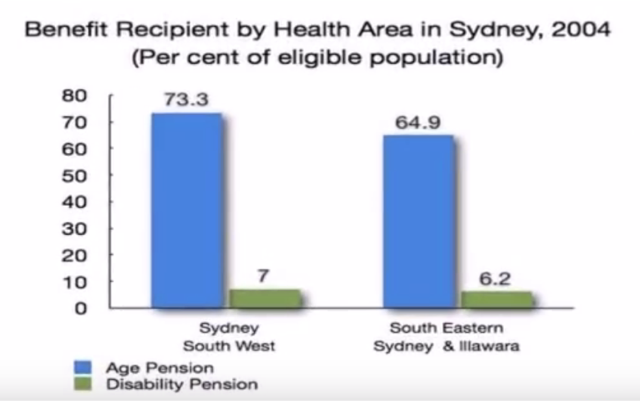
This bar chart represents the eligible population who benefit recipients of age, pension and disability pension in Sydney during 2004. About 73.3 percentage in Sydney South West and 64.9 percentage in South Eastern Sydney and Illawara region received the age pension was smallest proportion and 6.2 percentage were for the disability pension. The age pension was more in demand than the disability pension. In conclusion, the biggest recipients were age pension in the South West region, well least number of recipients were disability pensioners in Illawara region of Sydney.
PTE EXAM PREPARATION – PTE Reorder Paragraphs Practice With Answers
- Describe the given below bar graph #3
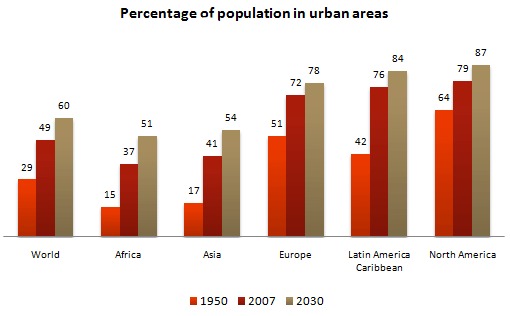
The bar chart shows the percentage of the population in urban areas of the world and compares it with continents from 1950 to 2007 along with the projected percentage for 2030.
The proportion of the increase in world population residing in cities is expected to double from 1950 to 2030. This rate is smaller in two continents, Europe and North America. Like in North America, 64% of the population was urban in 1950, increasing to 79% by 2007 and is expected to increase 87% by 2030. Latin America-Caribbean represents almost the same rate as that of world average from 1950 to 2030. The percentage is projected to be higher than Europe in 2030, in spite of being lower in 1950.
It is also clear from the graph that, urbanisation in Africa, Asia is much more than the world average because the percentage of Africa population was 15% in 1950 and rose to 51% in 2030, which is almost triple the world population.
Practice More – Describe The Picture And Answer The Questions
To stay updated, like us on Facebook. Don’t forget to write your own answer in the comment box.


