PTE Exam Preparation Describe Image Pie Chart Study Guide Explanation
After practicing PTE Describe Bar Diagram, be careful with the Pie Chart because sometimes lots of variables are given in Pie Chart. So try to explain minimum, maximum and any exception.
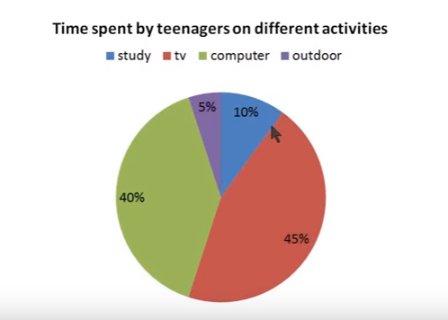
In this case, we’ll say “The Pie Chart shows time spent by teenagers on different activities”. One important to notice here is “time spent by teenagers”. The percentage given in Pie Chart is time not the percentage of teenagers. We can’t say 45% of teenager spend time on tv, (this is totally wrong).
So the Pie chart describes time spent by teenagers on different activities such as study, tv, computer and outdoor activities. Approximately 45% of the time teenagers spend on watching tv – which is maximum. Minimum time i.e only 5% which is spent on outdoor activities, 40% of time teenagers spend on computers and only 10% of the time spent on the study.
Conclusion: The teenagers spend the least amount of their time on outdoor activities. So this is how you can explain and if there are a lot of variables just stick with the minimum, maximum and any exception or if there is any equal number of variables we can say like 10% for two variables. Suppose the teenager spend 10% of their time on computer and tv. So make sure the minimum, maximum either exception on any equal figures.